Movies That Use Color Brilliantly
Films.io Editorial
5 min read
Every time I think about color in movies, I keep coming back to one idea: the best filmmakers don’t just point a camera at something pretty. They weaponize color. They use it to make you feel anxious, hopeful, heartbroken, or disoriented before you even understand why. Color in movies is one of those things most audiences absorb unconsciously, but once you start noticing it, you can’t stop.
The psychology of color in cinema is fascinating because it works on a primal level. Red doesn’t just mean “danger” or “passion” the way a textbook might tell you. In the right director’s hands, red can mean obsession, decay, or even divinity. And when a filmmaker commits fully to a color palette, restricting what you see or drowning you in a single hue, it reshapes the entire emotional architecture of the story.
When Color Becomes a Character
Some films treat their palette the way other films treat their lead actors. Color doesn’t just set a mood. It drives the narrative.
Take TÁR (2022). Todd Field’s film about a celebrated conductor unraveling is drenched in cold, institutional tones. Grays, muted blues, the sterile warmth of concert hall wood. There’s almost no visual warmth in Lydia Tár’s world, and that’s entirely the point. She exists in spaces designed to project authority and control, and the desaturated palette mirrors her emotional detachment. When color does creep in, a flash of something warmer in a more intimate moment, it feels almost intrusive. You notice it because the film has trained you not to expect it.
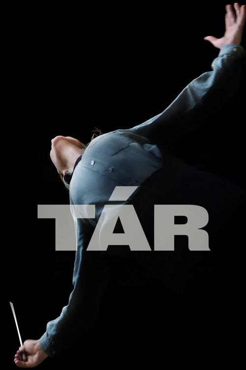
What makes TÁR’s use of color so effective is its restraint. Field isn’t showboating. He’s building a visual prison around his main character, and you feel that claustrophobia even if you never consciously register the color choices. That’s the mark of great color work. You feel it before you see it.
The Anxiety Palette
Color psychology gets really interesting when filmmakers use it to make you uncomfortable. There’s a specific brand of sickly, oversaturated color that’s become a signature for certain directors, and nobody does it quite like Ari Aster.
Beau Is Afraid (2023) is a three-hour anxiety attack dressed up as a dark comedy, and its color choices are unhinged in the best possible way. The film cycles through wildly different visual registers, from the grim, brown-tinged squalor of Beau’s neighborhood to the aggressively cheerful pastels of a suburban home that feels like a trap. The colors keep shifting because Beau’s reality keeps shifting. Nothing feels stable, and the palette reinforces that instability constantly.
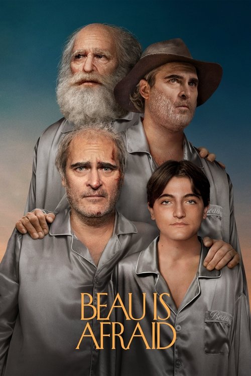
There’s a sequence in the middle of the film, an animated interlude, that explodes into watercolor tones completely unlike anything else in the movie. It’s gorgeous, but it also feels fragile and temporary, like a dream you’re about to be ripped out of. And that’s exactly what happens. Aster uses color transitions as emotional whiplash, and it works because the shifts are so deliberate. Every new palette signals a new layer of Beau’s psychological torment.
I’ll be honest, Beau Is Afraid doesn’t fully work as a movie. It’s overlong and sometimes feels like Aster is indulging himself at the audience’s expense. But visually? It’s one of the most ambitious color experiments of the decade. Every frame is doing something with hue and saturation that maps directly onto Beau’s mental state.
Color as Class Signifier
One of the smartest things a filmmaker can do with color is use it to mark social boundaries. You see this in Couture (2026), Alice Winocour’s film set during the chaos of Paris Fashion Week. The world of haute couture is all razor-sharp whites, silvers, and carefully controlled pops of color. Everything is curated. Everything is intentional. And when the film follows characters outside those rarefied spaces, the visual language changes completely.
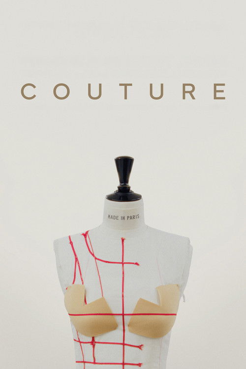
The contrast is the whole argument of the film. Winocour doesn’t need dialogue to tell you who belongs in these spaces and who doesn’t. The color does it for her. Characters who exist in the fashion world are bathed in clean, high-contrast light. Characters grappling with the world’s actual problems exist in messier, more saturated, less controlled palettes. It’s a subtle but devastating visual thesis about who gets to live in beautiful spaces and who gets shut out.
Nature’s Palette as Emotional Mirror
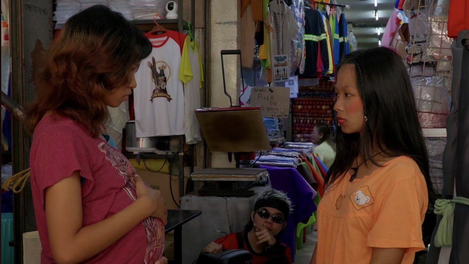
Where fashion films use color to expose artifice, 森中有林 (2026) finds its chromatic power in the natural world. This drama draws on the lush greens and deep earth tones of forested landscapes, creating a visual language where the environment reflects the interior lives of its characters. The saturation of the foliage shifts with the emotional currents of the story, dense and almost overwhelming in moments of confusion, then opening into lighter, more luminous tones as clarity arrives.
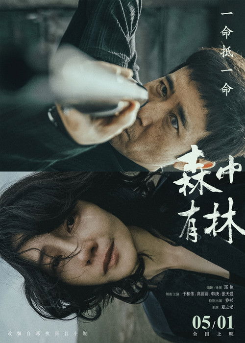
What’s remarkable is how the film uses the limited palette of a single natural setting to achieve enormous emotional range. You wouldn’t think a movie dominated by greens and browns could create such varied moods, but the subtle modulations in tone, the way light filters through canopy and the way shadows pool on forest floors, turn the same basic colors into vehicles for grief, wonder, peace, and dread. It’s a masterclass in how color doesn’t need to be loud to be deeply expressive.
Color Unleashed
If TÁR represents the power of chromatic restraint, Buntestant (2026) sits at the opposite end of the spectrum, literally. The film embraces a maximalist color philosophy where saturation is cranked up and palettes clash with deliberate, almost confrontational energy. It’s the kind of movie where color isn’t just supporting the story; it’s practically screaming at you.
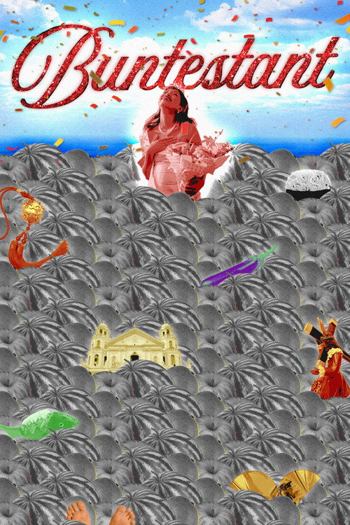
What keeps it from tipping into visual noise is that the excess is the point. The film’s comedy operates on the same frequency as its color work: loud, brash, and willing to overwhelm you in pursuit of a reaction. There’s a fearlessness to using color this aggressively in a comedy, where most films in the genre default to safe, neutral tones. Buntestant treats every frame like a dare, and even when it’s too much, it’s too much in a way that feels alive and intentional.
Why Restraint Hits Harder Than Excess
Here’s something I think gets overlooked when people talk about color in movies: sometimes the most powerful choice is pulling color back. Desaturation, near-monochrome palettes, and selective color restriction can be more emotionally devastating than any neon-soaked frame.
Think about it this way. If every scene in a film is visually loud, nothing stands out. But if you spend ninety minutes in a muted, gray world and then a single object blazes with color, that moment burns itself into your memory. The best color filmmakers understand that contrast is everything. It’s not about how much color you use. It’s about when and where you deploy it.
This is why TÁR’s approach is so effective. The restraint makes the occasional warmth feel like an event. And it’s why Beau Is Afraid’s constant palette shifts create such unease. Your eyes never get to settle. Couture maps its color choices onto social hierarchies with surgical precision, 森中有林 finds infinite emotional range within nature’s seemingly limited palette, and Buntestant proves that going loud can be just as intentional as going quiet, as long as every hue is earning its place.
The Emotional Cheat Code
Color psychology in film isn’t some academic exercise that only matters to cinematographers and production designers. It’s the reason certain movies stick with you for years while others fade from memory a week later. When a filmmaker commits to a color philosophy, when every costume, every wall, every light source is working in service of the same emotional argument, the result is something that bypasses your intellect and goes straight for your gut.
The films that use color brilliantly aren’t always the most colorful ones. Sometimes it’s the gray film with one red dress. Sometimes it’s the sickly green film that makes your stomach turn. Sometimes it’s the fashion world rendered in sterile silver so the ugliness underneath becomes impossible to ignore. Sometimes it’s a forest whose greens shift so subtly you don’t realize the entire mood has changed until it already has. And sometimes it’s the film that cranks every hue to maximum and dares you to look away.
If you’re looking for more films that make bold visual choices, browse our full collection. And if drama is your thing, many of the most interesting color work happens in that genre. Start paying attention to the palette next time you watch something. Once you do, you’ll never watch a movie the same way again.
Discover Your Next Favorite Film
Browse our curated collection of movie trailers and find something new to watch tonight.
Browse Trailers